
REFLEKSOLOGIKLINIKKEN
Standing out in a crowded field
Overview
Refleksologiklinikken is a small Norwegian company that offers reflexology treatment, to help people of all ages recover from injury, improve their overall health and quality of life.
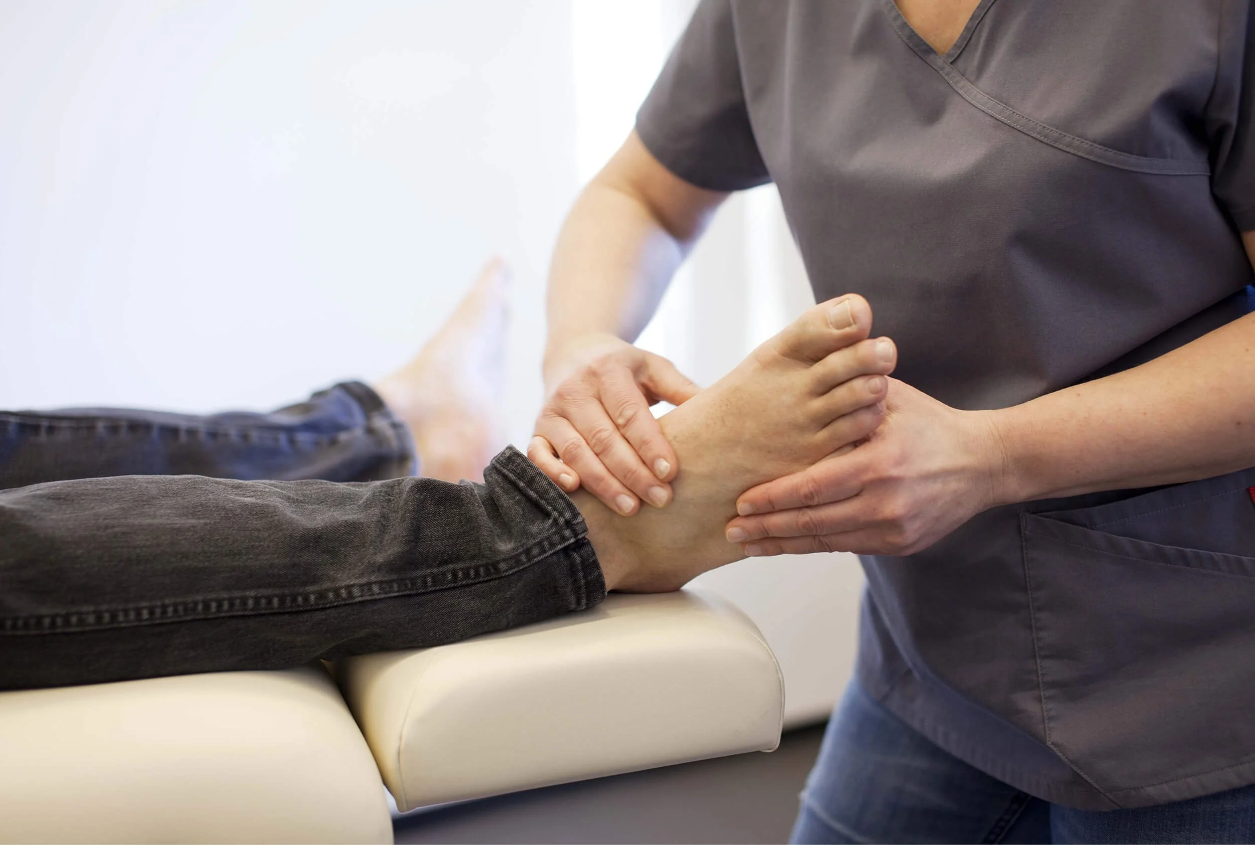
Reflexology is a natural and drug-free treatment method based on the body’s network of point systems on areas like hands, feet and ears. The practitioner uses acupressure techniques by applying pressure to these areas to improve blood and energy circulation, reduce stress, improve sleep and more.
Role
Branding / Project management
Team
Visual designer, web designer

Challenge
Reflexology is more of an alternative medical practice than a traditional one, and the treatment is not scientifically proven and documented. Being taken seriously as an alternative medical practice is sometimes challenging.
The client came to me with a desire to stand out as a professional and serious clinic amongst many small and sometimes less professional businesses.
Solution
I collaborated with the client to create a visual identity based on the holistic aspect of reflexology in a distinctive colour palette. This approach aligned with the client’s values and made the clinic stand out from the competition.
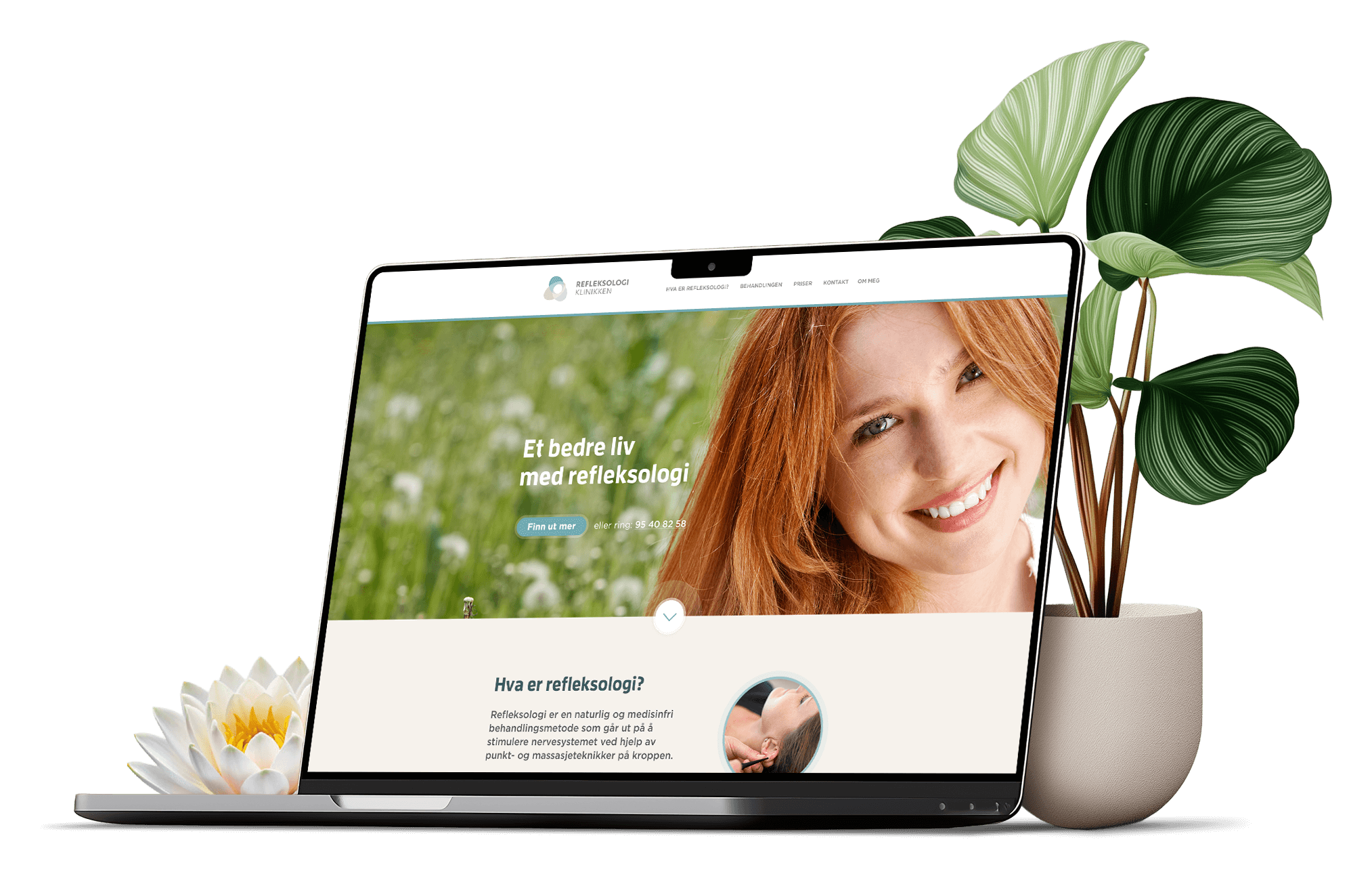
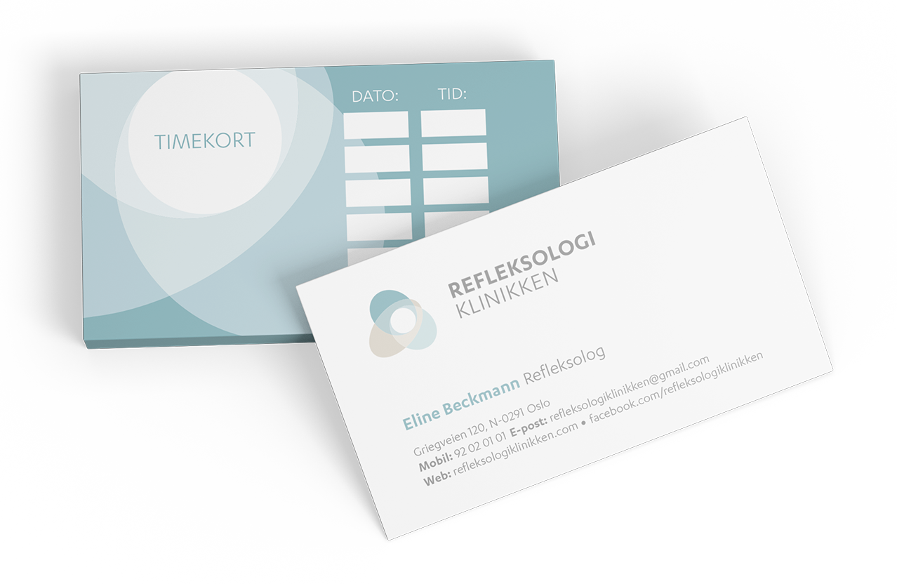
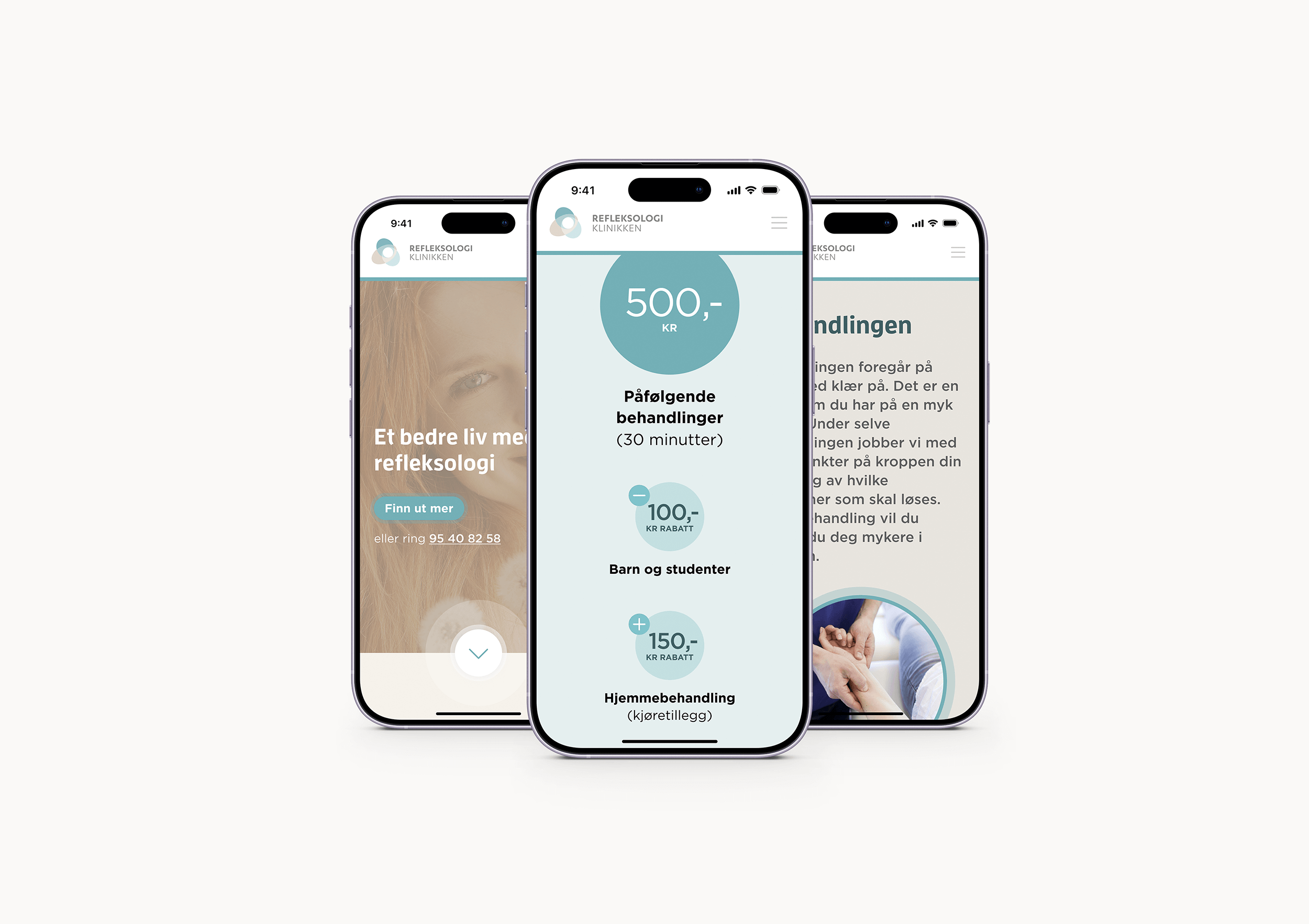
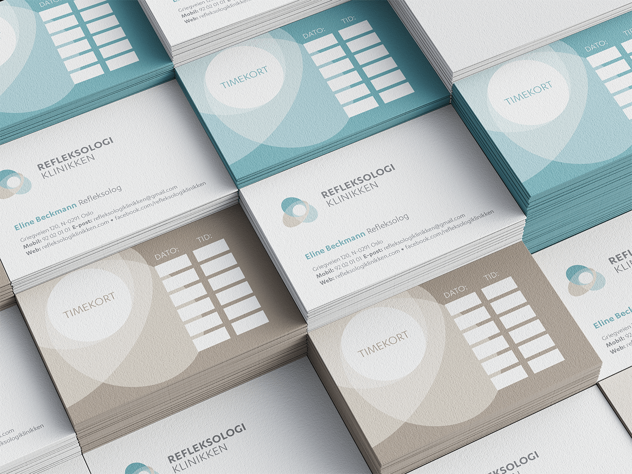
To streamline communication and booking between customers and the clinic I created appointment cards. And to ensure brand consistency across channels I collaborated with another designer on the website.
Research
In order to uncover valuable insight about the alternative treatment industry I used a combination of the client’s existing market research, supplemented with my own branding-specific research.
Some interesting patterns emerged from studying the competition. This helped me decide what to align with and what to avoid, so I could turn Reflekologiklinikken into a distinctive brand whilst staying true to its values.
RESEARCH
Stakeholder workshop
In collaboration with the web designer I conducted a stakeholder workshop, during which we did two visual exercises to gain further insight into the company, their target audience, values and personality.
I chose an informal setting for the workshop, setting the scene for a relaxed and open conversation. I explained the goal of each exercise to the client, and gave them enough time to reflect on their answers.
Exercise 1:
Brand personality chart
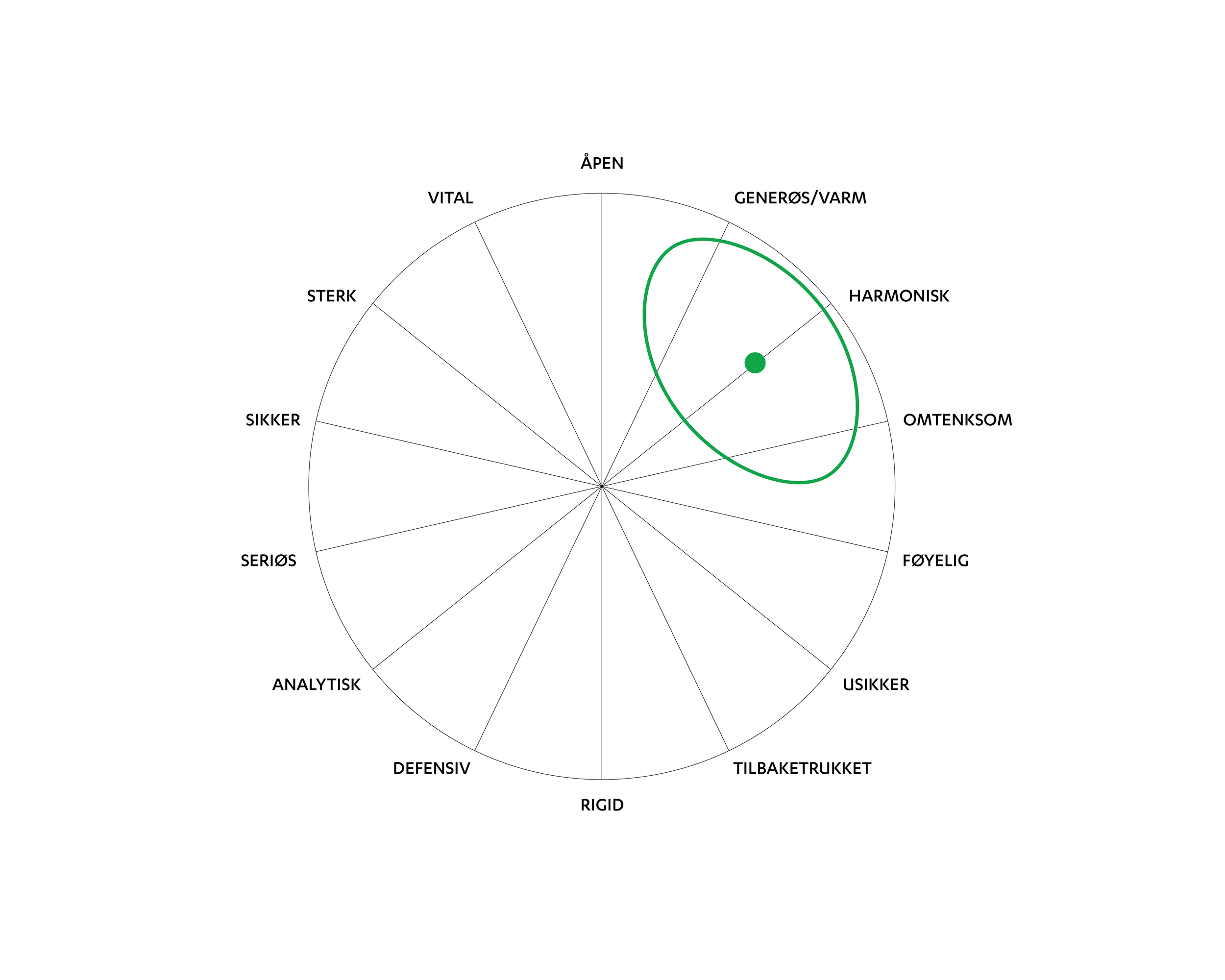
The purpose of this exercise is to uncover the core personality of the company. I asked the client to choose three adjectives that described them best, from the 14 in the chart, ranging from analytical to generous.
Exercise 2:
Semantic differential scale
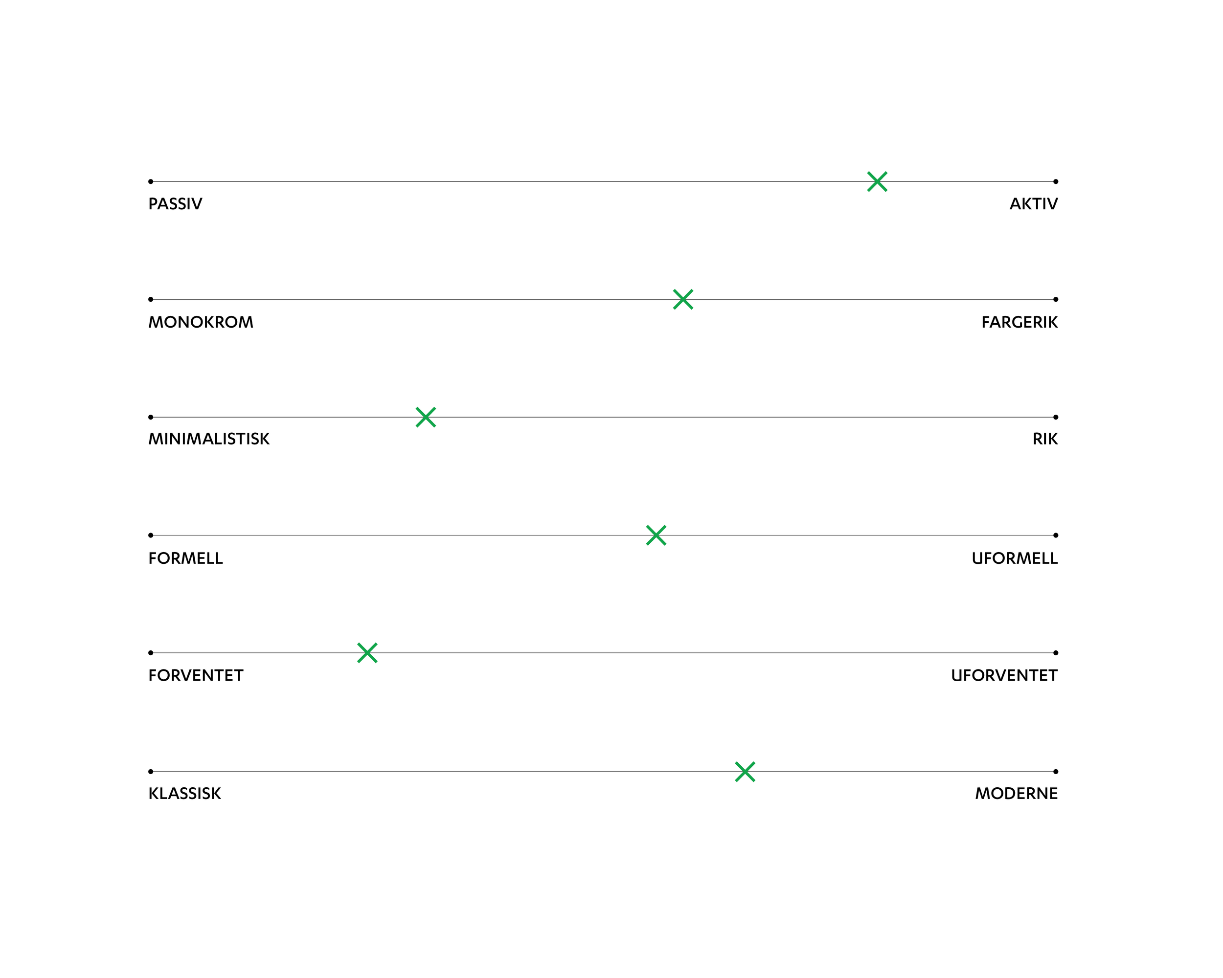
The purpose of this exercise is to gain further insight into the client’s core preferences, to generate ideas for the visual identity. I presented them with 6 pairs of opposite adjectives, such as classic vs modern, and put an x next to the adjectives they most identified with.
Workshop findings
Core personality
From the process we learnt that the client defined their company as generous, harmonious and thoughtful, with harmonious being key.
Key visual traits
Key traits were skilled, professional and accommodating. Some of the visual preferences were natural and clean lines, and blue and earth colours.
Understanding
The insights led to an understanding of the company’s core and preferences. This understanding led to ideas for developing the visual identity.
Valuable insight
The client felt the workshop was valuable as both the interview questions and branding exercises made them reflect deeper on what the company should and shouldn’t be.

“The clinic should be approachable, demonstrating good professional skills and people skills. It should not be messy, unserious, insistent or hippy.”
— Ingvill Nilssen, Reflexologist and Founder, Refleksologiklinikken
RESEARCH
Competitive analysis
By digging into the research I found that competitors offering similar treatments range from the physiological such as massage, to the spiritual such as healing.
Across the range of competitors there were several similarities in their visual identities and how they communicate.
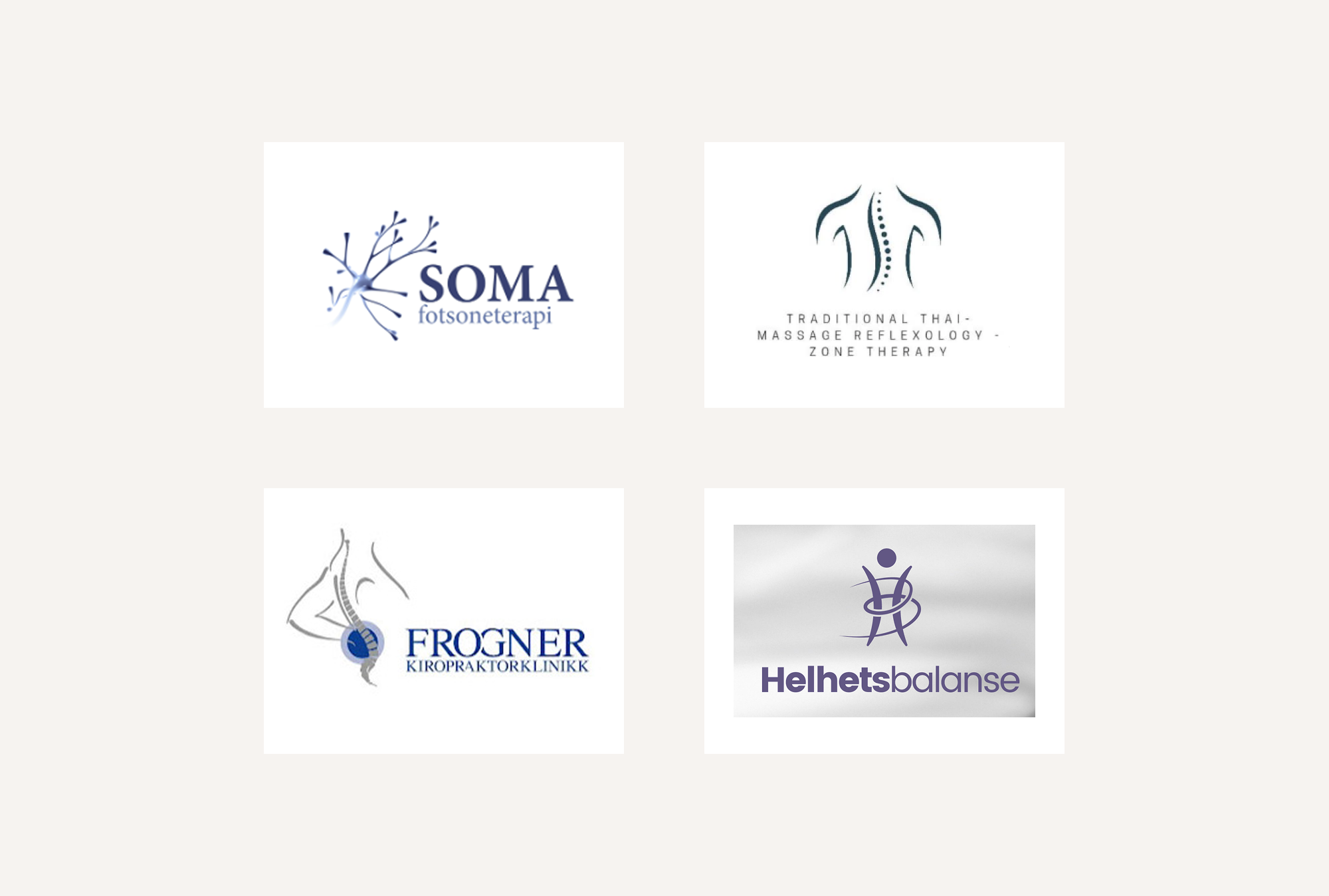
Complex logomarks affect readability.
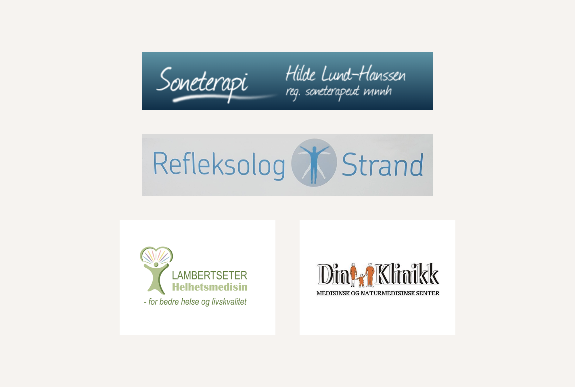
Font and colour choice affect readability.
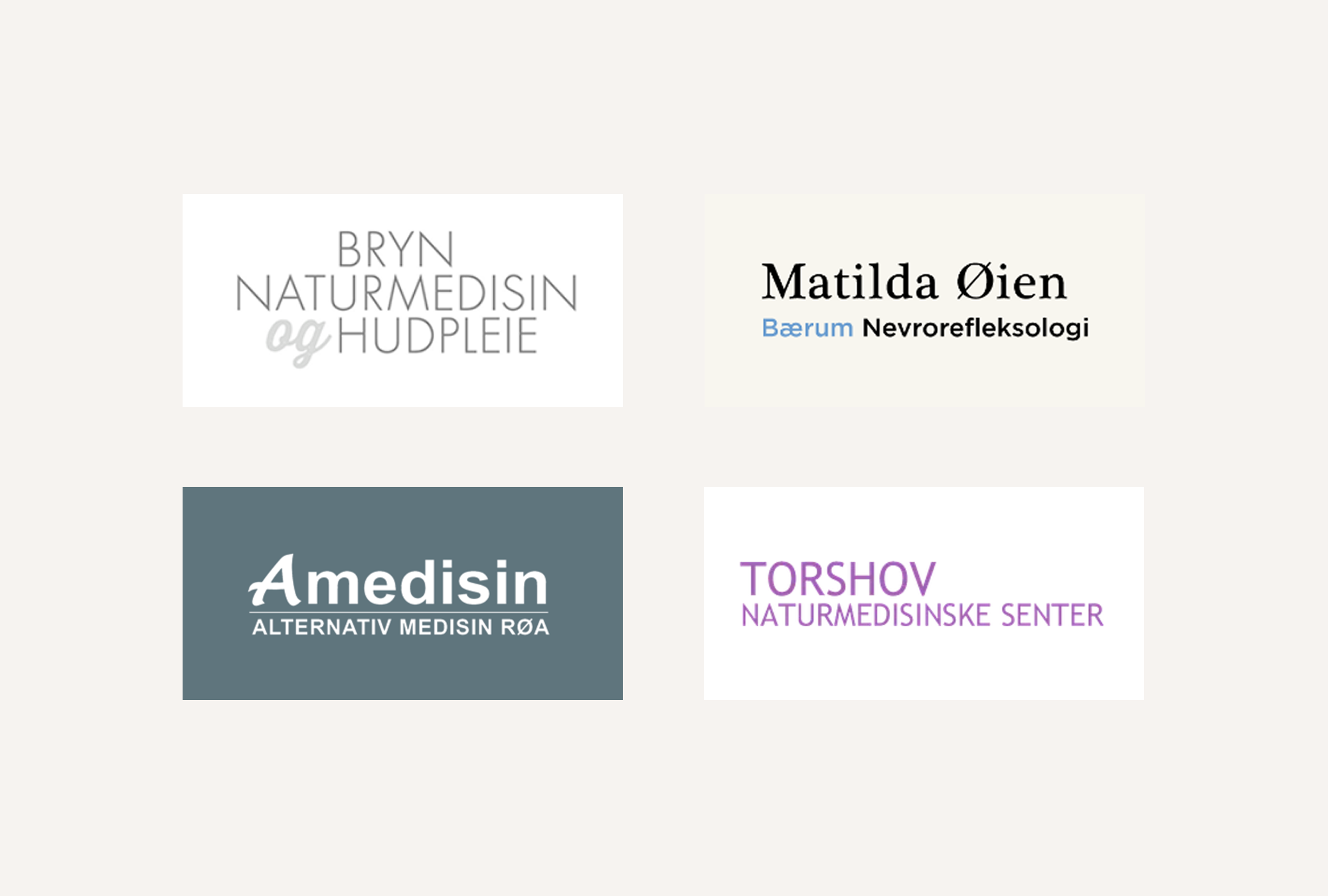
Logos lack a distinct personality.
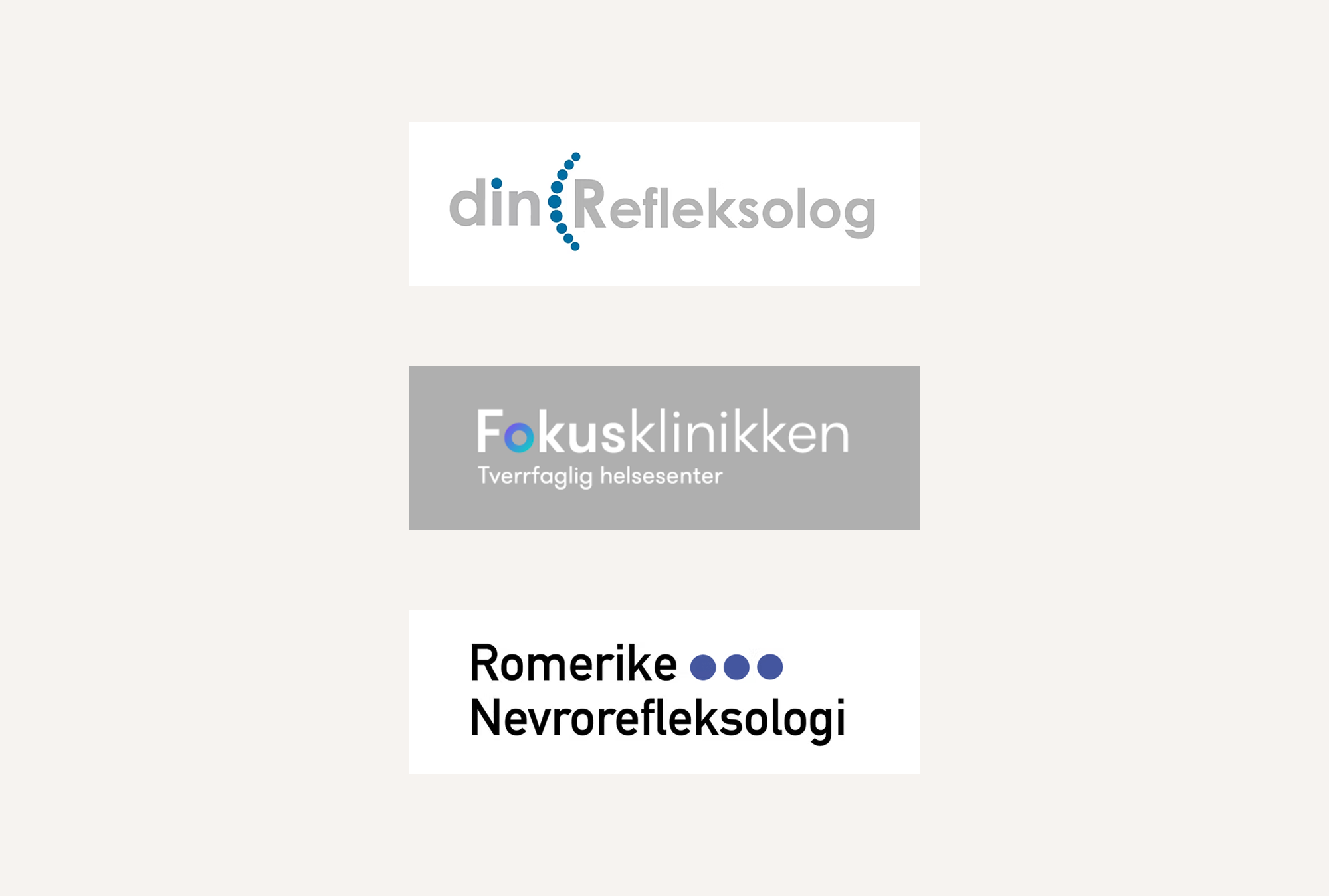
Logos refer to acupressure technique.
Analysis findings
What we want to avoid
What I found across many of the competitors was that their visual identity and websites lacked finesse. The design was inconsistent and the generic fonts, uncurated images, and readability issues affected the overall impression.
Many clinics lacked a distinct personality and were hard to tell apart since they used the same cold colour palette of blues, purple and white, and their logos had common traits.
What we want to align with
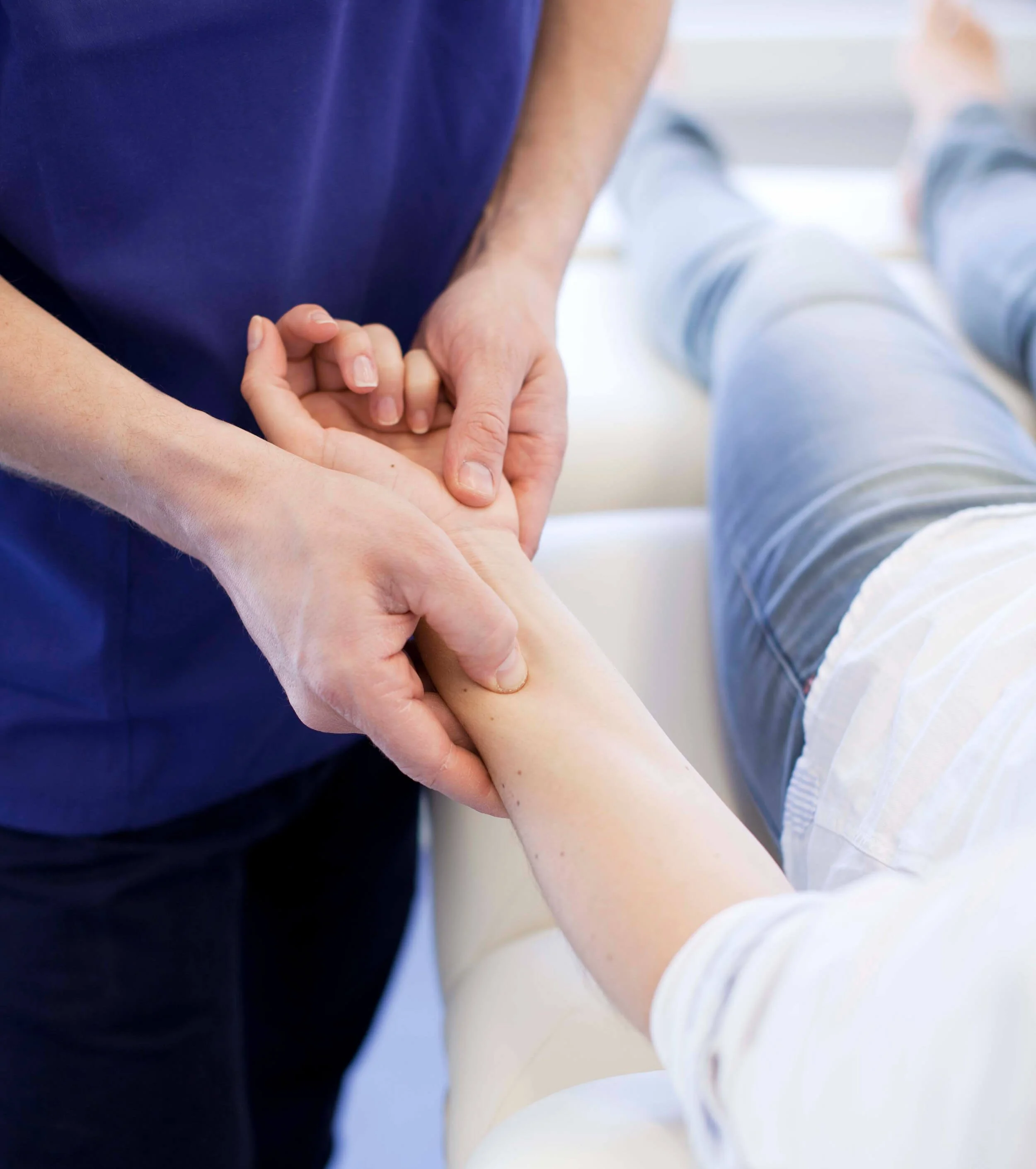
Some websites had friendly staff photos, which made the clinic more personal and welcoming. The overall tone of voice was friendly, and didn’t include much jargon.
Some of the logos referred to the acupressure technique. This is an important part of reflexology as it lets the practitioner stimulate zones with point pressure to influence the body to relieve stress and promote healing.
Design
I used insights from the research and stakeholder workshop to identify themes, colour palette, and typography to start developing the Refleksologiklinikken brand.
In collaboration with the client I identified a gap in the market for a clinic that felt different from the others by being both comfortable and welcoming, and professional and serious. This aligned well with the brand values, and became the north star.
DESIGN
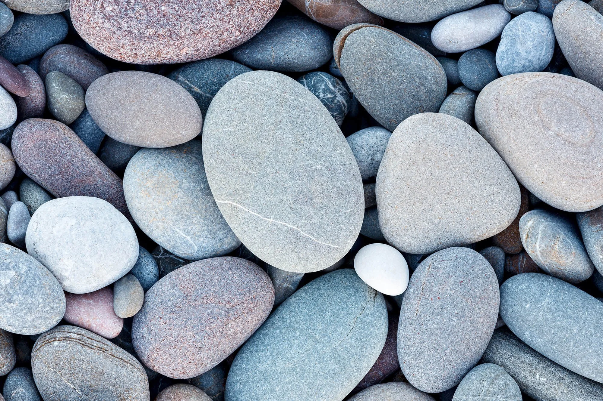
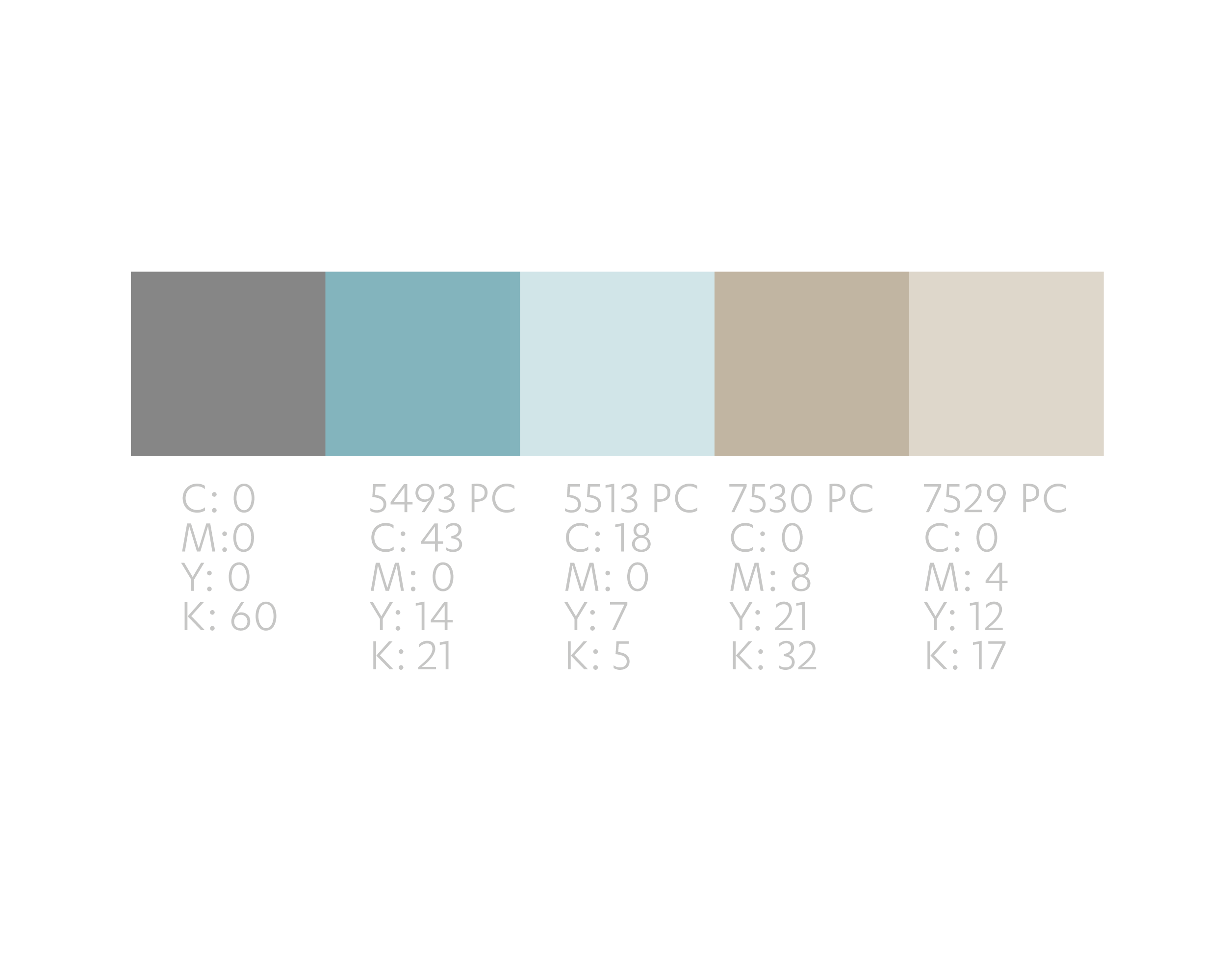
Colour
To make Refleksologiklinikken stand apart from the cold and clinical blues used by many competitors we chose a warmer colour palette of teal and brown inspired by Nordic nature. This also emphasised the clinic’s Nordic roots.

DESIGN
Logo
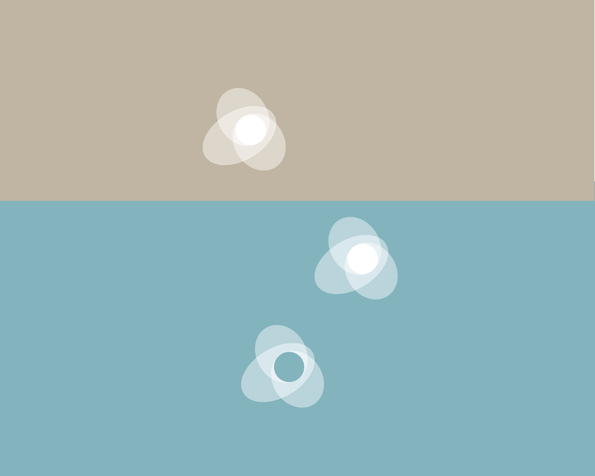
After iterating on different ideas, we developed a logomark based on acupressure, an important reflexology technique.
Competitors’ logos referred to acupressure through individual dots. I wanted to create a logomark that showed the repercussions of acupressure to other parts of the body, a holistic view that’s key to reflexology.
DESIGN
Typography
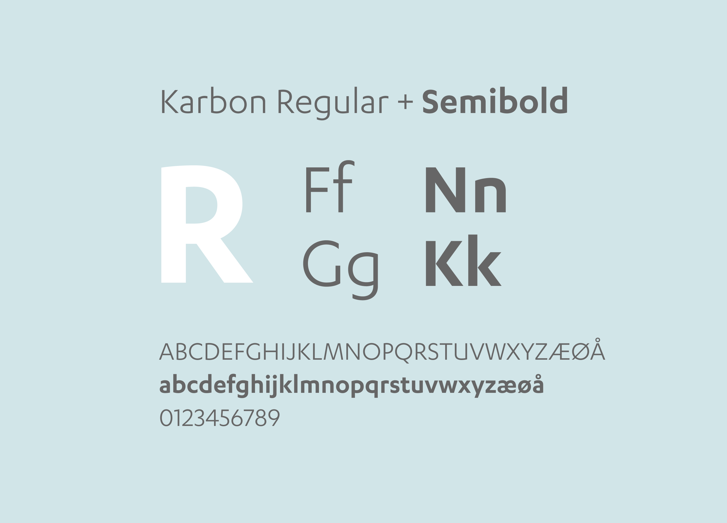
To convey some of the clinic’s key personality traits as professional and accommodating I chose Karbon, a sans serif font.
To improve readability I put the company name on two lines using different font-weights, and picked colours that would work on both light and dark backgrounds.
DESIGN
Brand building
Consistency
The visual identity was the starting point for developing the business cards and website. To ensure brand consistency I worked closely with the designer who created the website.
Personality
The clinic’s personality traits professional and accommodating were communicated through natural colours, typography, friendly images and tone of voice.
Standing out
We built brand consistency across different formats so the clinic stood out as professional and serious amongst many small and sometimes less professional businesses.
Communication
To streamline communication and booking between the clinic and its customers, the business cards had appointment cards on the back.
Outcome
The client was delighted with the visual identity, business cards and website, and felt that the branding and communication reflected the company’s values really well.
The appointment cards and website made it easier and more efficient to contact the clinic and book appointments.
The project really benefited from the close collaboration I had with the client. Throughout the project we had a great dialogue, which meant we could align, iterate more quickly and find solutions together.
“The new branding increased the quality of the overall impression of the clinic. This meant that the customers felt well looked after and wanted to return.”
“The conscious use of colour became a common thread through all communication and decor, creating a professional expression aligned with the company’s values.”
— Ingvill Nilssen, Reflexologist and Founder, Refleksologiklinikken